How to track and leverage customer data to improve CX.
Knowledge is power, especially in the world of customer service. According to the 2020 CX Trends Report, companies that leverage the most data have 36% faster resolutions, 79% reduction in customer wait time, and four times as many solved customer requests.
But to reap those benefits, you need a powerful business intelligence tool. Zendesk Explore allows you to identify important trends, find ways to improve your team’s interactions with customers, and gauge customer satisfaction with your brand. Companies that use Explore handle 3.4 times as many tickets as those that don’t use the tool, and their customers spend half as long waiting for agents to respond.
How does it make such a big difference? Explore tracks and measures every aspect of the customer experience. And it makes all of those analytics more accessible than ever with custom reports and dashboards you can use to manage and optimize CX.
Understanding every customer interaction with omnichannel analytics
Customer support interactions can happen anywhere, from a call center to a comment on a social media post. Explore tracks data across every communication channel to give you visibility into the full customer experience.
It also makes it easier to figure out your customers’ preferred contact methods so that you can prioritize and optimize your most popular channels. For example, tracking ticket volume by channel and day of the week lets you know which channels are used most frequently and when they are most active.
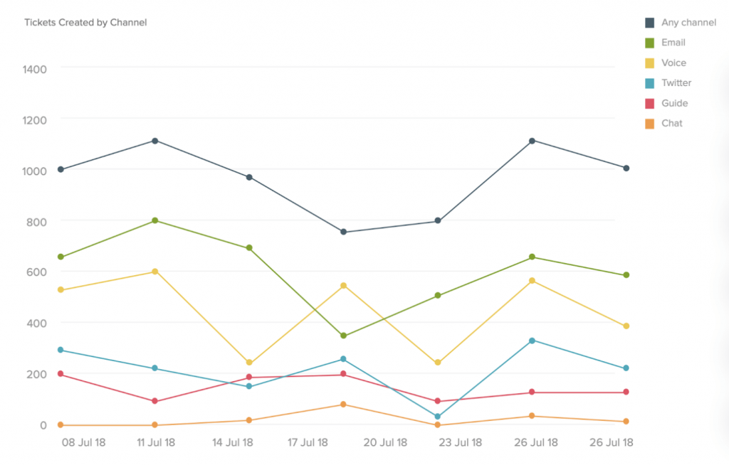
Similarly, tracking customer satisfaction (CSAT) scores and wait times gives you a good indicator of each channel’s effectiveness. The channels with the highest satisfaction rates and fastest resolution times are the ones you’ll want to invest in and promote to users.
The lifestyle brand Spartan Race has used Explore to continually optimize their AI-powered answer bots, which suggest articles to customers based on their chat queries.
“They are tracking the resolution rate of suggested articles to see if they’re adequately deflecting a customer request,” explains Andrew Forbes, Zendesk’s group manager of product marketing. “And then they’re looking through all their articles to see how folks are voting on those.”
If an article has a low satisfaction score, the company works to adjust it or create new knowledge content that will better answer customer questions.
And that’s just one aspect of one channel; Explore integrates with every part of the Zendesk suite to help users get the most out of their software.
“Our customers use Explore to analyze data from all the Zendesk products that they use,” Andrew says. “Explore integrates with Zendesk Support, Chat, Talk, and Guide and allows folks to dig in on all the customer support interactions that happen across those products.”
Tracking customer experience with pre-built and customizable dashboards
The design and complexity of your dashboard should reflect the needs and size of your organization. Startups tend to have simpler dashboards than enterprises, just like people who drive Honda Pilots have smaller instrument panels than people who pilot passenger jets.
“Customers get pre-built dashboards right out of the box with Explore,” Andrew says. “They’re great for teams that are just starting to provide service to their customers for the first time.”
For startups and SMBs, these fresh-out-of-the-box dashboards come complete with hundreds and hundreds of table-stakes metrics. Explore provides instant insight into some of the most important customer experience trends you need to be following.
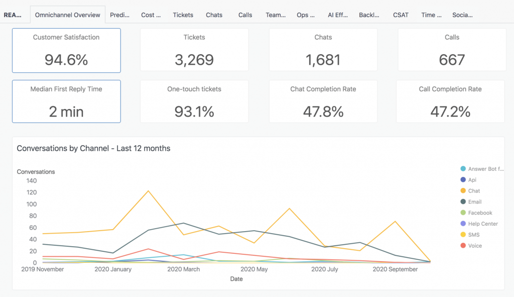
Even larger, more established companies often make use of these dashboards. The crafts shopping site Etsy, for example, has used many of Explore’s pre-built metrics to improve CX operations.
“Etsy’s core use case is measuring team performance and understanding how their agents are doing,” Andrew says. “So they’re digging in on things like first response times, satisfaction scores by different agents and teams, and how quickly agents can resolve different issue types.”
With that information at their fingertips, the company is “now able to surface problem areas from our tickets, quickly fix routing rules, and identify training opportunities for our team,” says Colin Wilkinson, senior manager of agent enablement at Etsy’s Member Services.
For organizations that require tailored solutions, Explore also allows users to build custom dashboards from scratch.
“For example, a retailer is probably loading in some loyalty program information, so they might segment their customers by high value, medium value, and low value,” Andrew offers.
In that case, high-level information, such as CSAT scores, can be broken down by more targeted metrics, such as customer types or demographics.
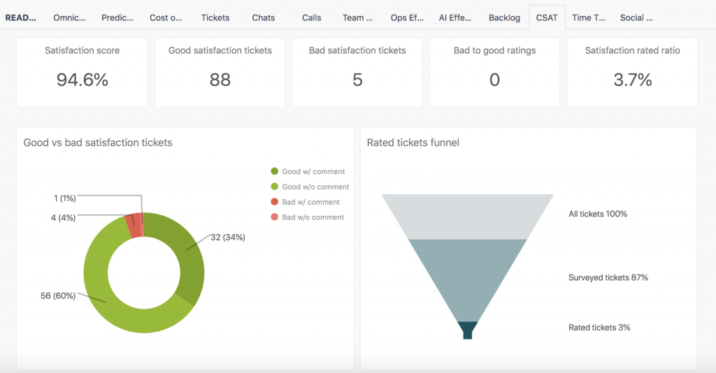
Many companies – including Zendesk – will also build new dashboards for big events, such as updates or product launches.
“When we launch a new product, our support team has a dashboard tracking how many tickets we get about it and how we’re handling those,” Andrew says. “We want to make sure that we’re keeping up with customer requests and that support isn’t getting in the way of the sales cycle.”
With the ability to create new dashboards at a moment’s notice, users can quickly organize new information when the unexpected – such as a global pandemic – occurs.
One Zendesk customer is a state labor department that has been using Explore to create a customized COVID-19 response dashboard. For months, it’s been tracking the hundreds of thousands of calls they’re getting about unemployment requests related to the coronavirus.
“This is a very custom example, where they are tracking everything that relates to the unemployment calls due to COVID-19,” Andrew says. “Are they completing calls, or are calls failing? Are people leaving the call early because they’re not getting answered soon enough?”
The department is also noting which days have the highest number of calls so that they can anticipate staffing needs. And Explore is helping them track how the number of requests rises and falls over time.
That may be a highly unusual use case, but the moral is clear – data empowers you to tackle unprecedented problems.
Measuring customer experience with robust charts and reporting options
It’s not enough to just measure everything. You have to display that data in an intuitive, easy to digest format.
Explore has over 20 types of charts available, along with a chart recommendation feature that helps match your specific data to the best possible visualization.
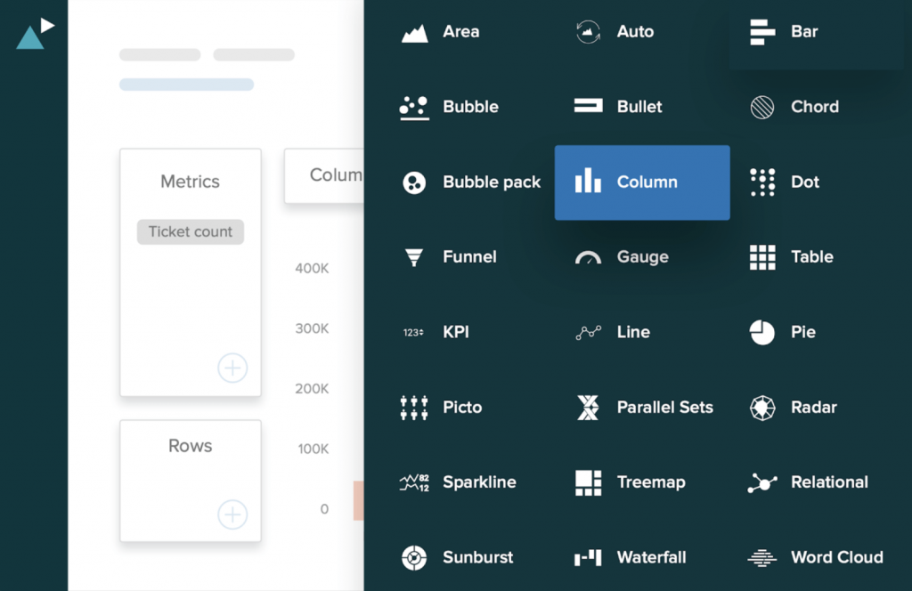
Say you’re trying to see how data results trend over time. In that case, Explore will suggest charts with a left-to-right progression, such as a line, column, area, or sparkline chart. On the other hand, say you’re directly comparing two or more categories. For those head-to-heads, a bar, dot, TreeMap, bubble pack, or Piktochart will be recommended.
Why so many choices? Because the right data visualizations will make trends and patterns easier to identify. For example, you can gain a much clearer picture of your customer base with charts showing how they break down demographically, or why they’re most likely to contact your company.
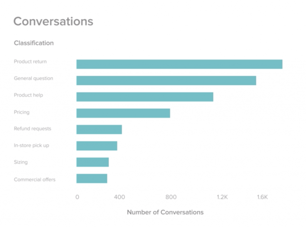
All the charts you build can quickly be added to a dashboard or shared with other colleagues. Explore makes it easy to generate automatic weekly reports that keep everyone updated on particularly vital metrics.
“I think the biggest thing that people do in Explore is use it to build a bunch of charts, add them to a dashboard, and schedule that out to folks on their team,” explains Andrew.
Of course, it should be noted that Explore’s reporting functions go beyond graphs. And they’re not limited to customer analytics, either.
Explore can also provide greater insight into your own support team’s success rate. Team and agent reporting lets you know whether your service reps are meeting certain benchmarks for support and how many tickets they’re fielding on a regular basis.
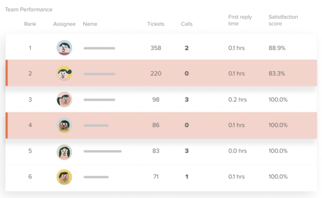
Sébastien Faure, head of customer service and support at the audio-tech company Devialet, uses Explore’s reporting functions and customizable charts on a daily basis to continually improve his support team.
The company gets as many as 8,000 support tickets a month around Christmastime. They rely on Zendesk Support to streamline their customer service in the face of overwhelming demand, and on Explore to continually monitor their global teams’ performance.
“It is easy to create tables via templates, but also to customize them,” Faure says. “The data is easily manipulated, and we can create attributes on the fly, which allows me to create exactly the reports I need, all with a very fluid experience.”
Gathering hundreds of insights in a matter of minutes
Companies need tools that have sophisticated capabilities but are easy to use. Tools that give every user access to tons of metrics, dashboards, and data visualizations that help clarify all of that information.
“All of the pre-built analytics that we’ve put in Explore are based on years of best practices,” Andrew says. “The fact that we allow customers to dive so deep into their data and customize their reporting really helps folks optimize their business.”
What could optimize your business? Better communication channels? More efficient support teams? Greater insight into your customer base? Find out today with a free trial of Zendesk Explore.
Consult us for your CX Transformation and Zendesk Explore Trial today.
Contact Us: Demeter ICT Company Limited, No.1 Zendesk Authorized Solution Provider in Thailand and APAC No.1 Zendesk Authorized Solution Provider in Thailand and APAC. [ Demeter ICT ] – Our specializations are “CX Design”, “Consulting,” “Implementation“, “System Integration” and “Training” for Zendesk. We help clients analyse, design workflows, and build a good CX.
LINE OFFICIAL

-
For additional information and special promotion call now!
Tel. (+66) 2 030 0066 (TH/EN)
Tel. (+86) 14778852841 (CH) - Facebook Page : @demeterict
- support@dmit.co.th
